Created at: Sidecar
Art Direction :: Branding :: Logo Design :: Packaging :: Web Design

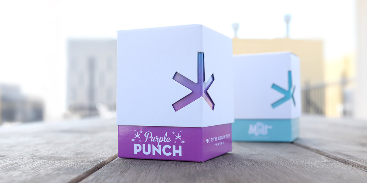
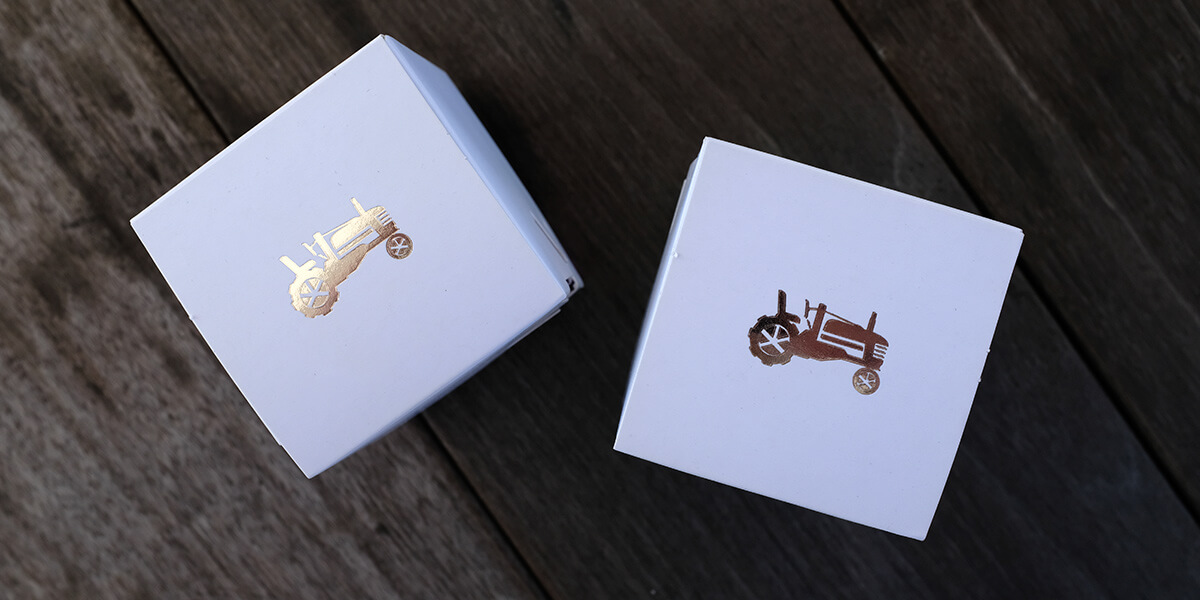
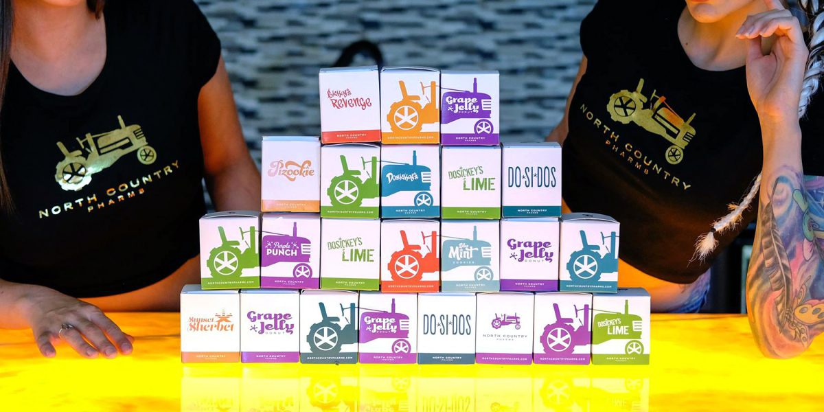
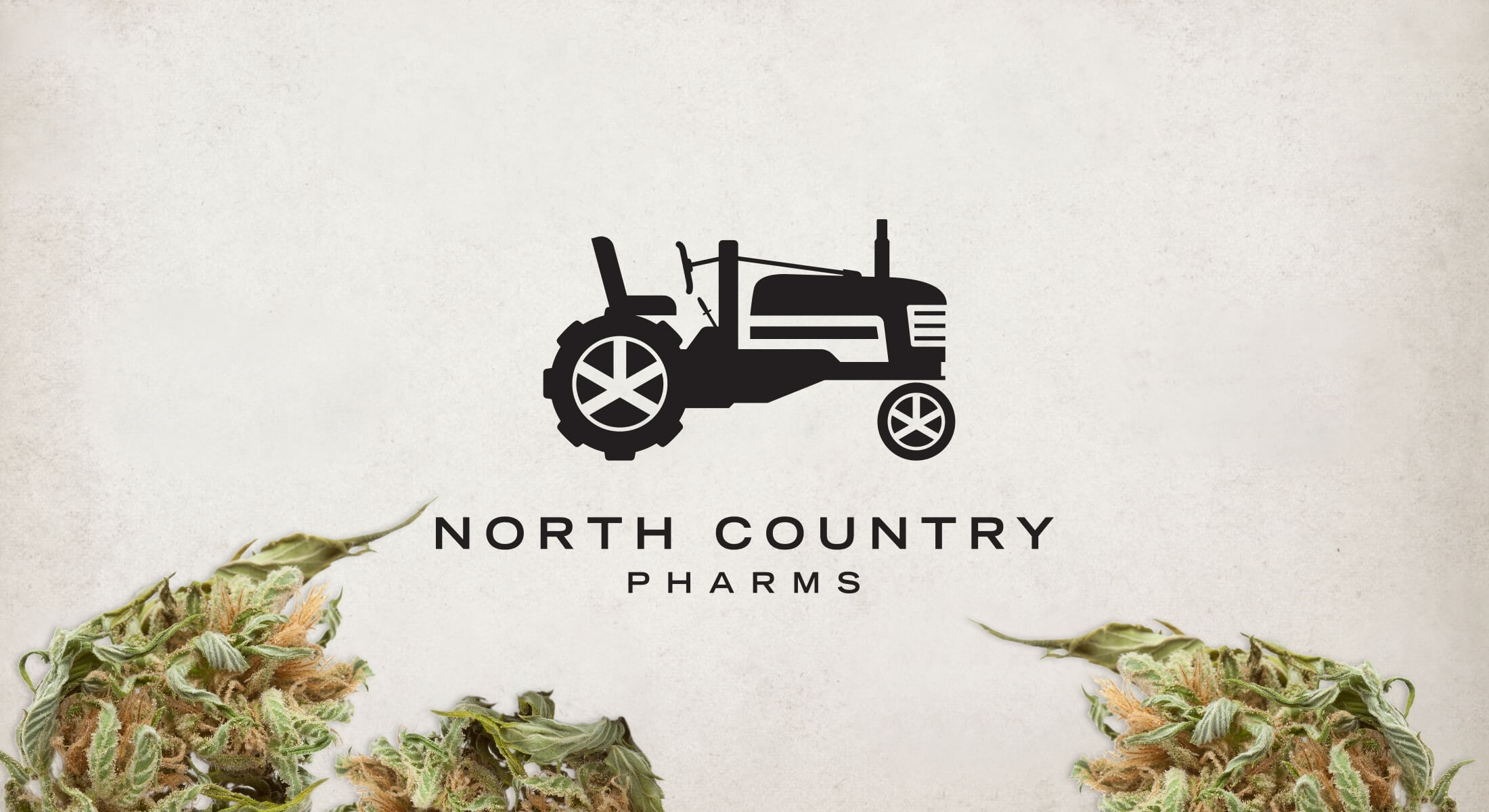
North Country Pharms offers a series of high end strains of cannabis, distributed by Northstar Holistic Collective. The design approach was to establish the brand as a premium option for consumers, without the stereotypical use of pot leaves and green color. The tractor logo includes subtle ties back to the parent company.

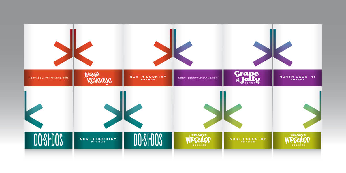
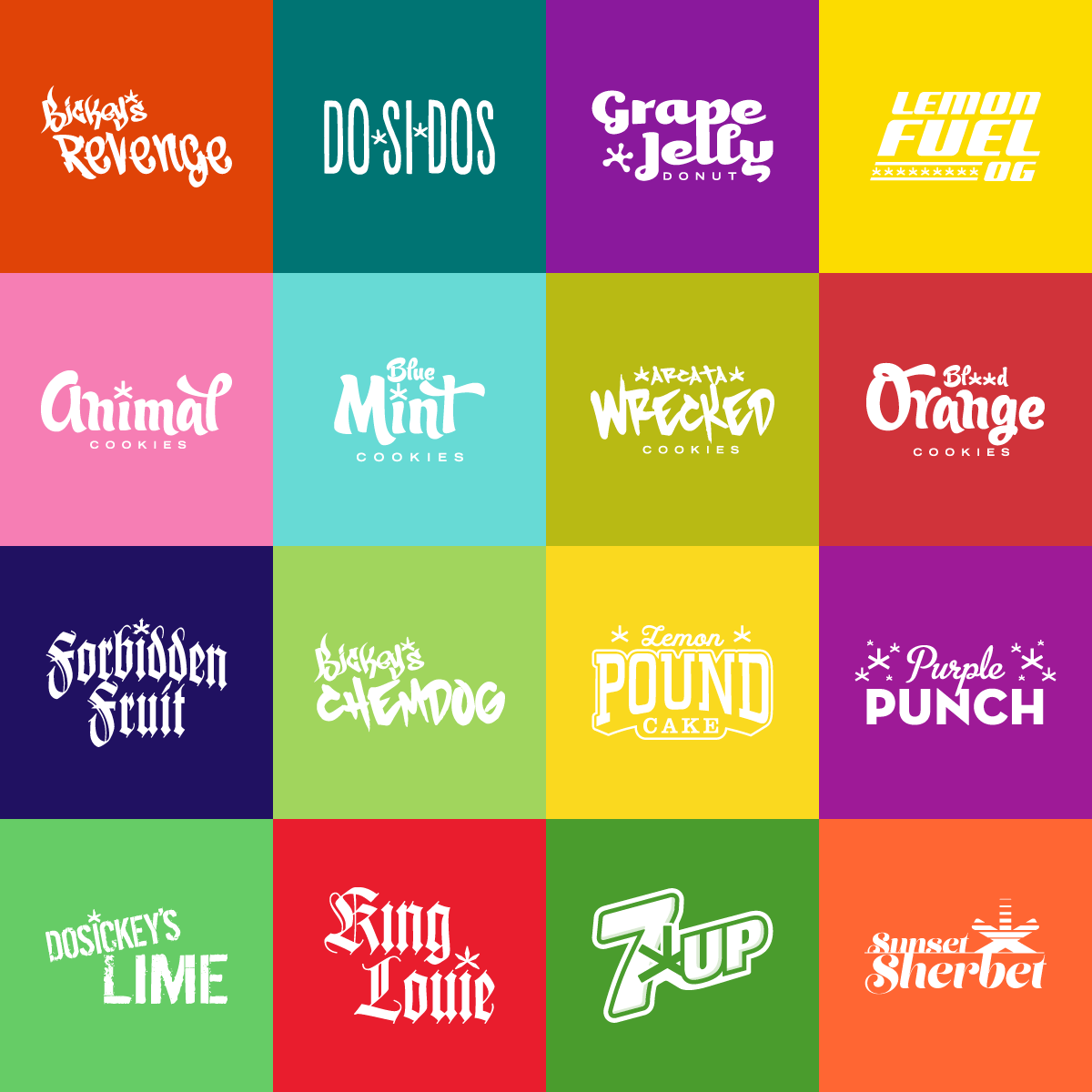
The original packaging system creates shelf presence with minimalistic white boxes contrasted with pops of color and high-touch details that include foil stamping and textured substrates. The jar labels were designed to capture each strain’s whimsical personality and flavor.

ncp_jars

For cost savings, we were tasked to transform the outer structure into a standard one-piece box. We were able to maintain the foil stamped tractor icon and textured substrate.

While the original packaging leaned on the Northstar branding, the client also wanted to take this opportunity to start establishing North Country Pharms as a standalone brand. The result was a redesigned package that plays up the tractor and flavor names. We kept the idea of the wraparound graphics to allow the package to billboard playfully.

Prior to developing the identity and packaging for North Country Pharms, we redesigned the logo and website for their parent company Northstar Holistic Collective. The textured logo, while refined, has a subtle nod to the products natural roots.

The objective for the website was to keep the layout flexible for the client to deliver fresh content from a variety of sources. We landed on a somewhat blog-like approach for the landing page, where the brand can deliver news about product launches, community outreach and industry news. The tiled system can expand based on content.